


Being extra isn’t always a good idea—well, we won’t be too opinionative and say that being extra is awful in every situation. What we mean is that sometimes, less is more, just because some things look good in their minimalist form.
For example, when people go crazy with their website designs, it can make the whole thing look cluttered and useless. While keeping things simple without sacrificing any of the essential aspects of it, makes a whole thing easier to navigate.
This is why understanding “Visual Hierarchy” is necessary for making your startup website designs both important and visually appealing without sacrificing any of the essential features.
In this blog post, we will go over Visual Hierarchy and its essential components for beginning websites. So, without further ado, let’s begin.
Visual hierarchy is a process of organizing objects on your website in a visually appealing manner. By placing your most crucial elements at the top, or highlighting it in a way that immediately draws the visitor’s attention.
Startup websites can benefit from visual hierarchy by arranging material on their website in an easy-to-navigate approach.
Just in case you haven’t heard about the benefits of visual hierarchy, we’ll spill the beans!
Must be wondering, “How?”
Well, the user-friendliness of your website’s interface makes visitors want to linger and explore more. This is how Visual Hierarchy improves and benefits your website immensely.
As Aarron Walter says:
If everything yells for your viewer’s attention, nothing is heard”
So, avoid demanding attention for each piece of content on your website and incorporate visual hierarchy into your website design.
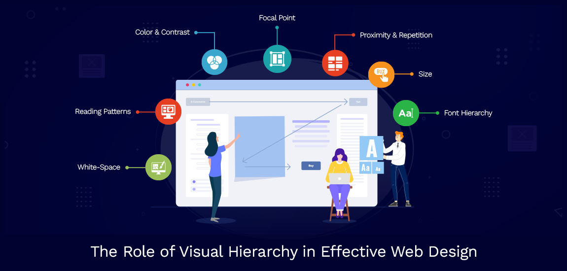
We’ve listed 8 important elements and principles of visual hierarchy for you to learn about and employ to make your site look professional and user-friendly.
Size is the most important factor, as the larger the elements are, the more they attract attention.
So, when building your startup website, you don’t need to make everything huge to attract attention.
Decide which items are the most vital, and the audience should not overlook them at any cost. And then only make the important information stand out by making it bigger than the rest.
Color and contrast are important to the eye. The more attractive the color scheme, the more appealing it looks to the viewer.
But that doesn’t mean you should go crazy with all sorts of colors for your website’s design.
Alternatively, you can go with a two-color scheme that works with your website’s objective and then use a third color to draw attention to anything important.
To create an engaging user space, you must include whitespace in your design.
Surely you’re wondering what this WhiteSpace term is about.
Simply put, WhiteSpace is the blank space on the page that you can leave as it is. You don’t need to add anything else to it.
This whitespace is a good tactic to highlight the most crucial sections of text on the page. With all that blank space, your material can shine alone and make it easy for users to navigate the page.
Graphics grab visitors’ attention the second they get on your website, therefore it’s a good idea to incorporate high-quality imagery into your startup web design.
It is a great way to enhance your web design with excellent quality and self-explanatory images.
Typography is another important aspect to consider because it will be the primary thing your audience reads and follows through on.
If you go crazy with fonts, it will make a bad impression and leave visitors bewildered.
Do not make every word a header or bold. Instead, logically arrange the material and choose strategic font pairs to complement the web design. Arrange type according to what you think is most important, what should go in the header, and what should go in the paragraph.
And go with simple, minimalist fonts instead of funky ones.
One more way to highlight something noteworthy is by using animations.
As we all know naturally our eyes will be drawn to any movement on a stationary page. So it is an excellent way if you want to showcase something significant; you can use animation to help automate your E-commerce Business.
A well-organized grid and properly aligned material create a visually pleasing and serene experience.
Consider Pinterest as an example; the website’s perfect alignment contributes to its attractive design, showcasing the importance of professional Web Application Development Services.
So, we can also arrange our data in that same specific way to make it appealing to consumers.
To make the clickable texts stand out and appear unique, you can incorporate subtle textures and gradients into them.
Using a texture instead of plain text is a great way to draw attention to and encourage clicking on specific words.
If you want your website to seem professional, well-designed, and visually appealing, then you must adhere to visual hierarchy rules.
The usage of these elements also contributes to higher engagement and conversion rates.
While designing a website think from your visitor’s perspective; consider how users will think about this content. Will they have trouble distinguishing between vital and unimportant information? If the answer is YES, then you should probably revamp the site’s layout to make it more user-friendly.
As people don’t spend much time on websites that are hard to grasp, therefore they don’t bother to learn how to navigate them.
So it’s vital to create a flawless and easy-to-use website design, by making visual hierarchy your ally and sticking to its components.